Ochre, Storm Grey and the Long Afternoon: Notes from a Coastal Studio
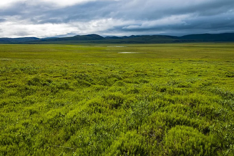
Photo: Daniel Case, CC BY-SA 3.0, via Wikimedia Commons
There is a particular colour the North Norfolk coast turns in the third week of November. It is not grey, exactly. It is more like the memory of grey — a soft, salt-bleached thing that sits somewhere between raw umber and the inside of a mussel shell. I have been chasing it for three weeks now, and the studio smells of turpentine, wet gesso and the radiator coming on at odd hours.
The light arrives late and leaves early
By the time I unlock the studio door at half past eight, the sun is still deciding whether to bother. On the coast path the shadows are long and blue; by four o'clock they have folded into the dunes altogether. This is the season that changes everything about the palette. Summer asks for cadmiums and clean whites. November asks for ochres, umbers, Payne's grey and a touch of something green that has already given up.
I have been working from sketches made at Salthouse, Cley and Blakeney, and from a handful of photographs that are honestly not very good. The photographs record shape; the sketches record temperature. That is the difference. A photograph will tell you the marsh was brown. A sketch made with cold fingers tells you it was brown with a violet edge and a sky that looked like a kettle coming to the boil.
Three pigment mixes I keep coming back to
I am not a paint chemist, but I am a creature of habit. These are the three mixes doing most of the work in the new canvases.
- Marsh ochre. Three parts yellow ochre, one part raw sienna, one part titanium white, and a speck of burnt umber just to stop it feeling too cheerful. This is the colour of the reed beds when the sun is behind cloud. It needs to be mixed thin and laid on with a soft brush, almost like a stain.
- Storm grey. Payne's grey, a little ultramarine, a little burnt umber, and enough white to make it behave. The temptation is to add black. Do not. Black makes a storm look like a suit. Payne's grey keeps a bit of blue in it, which is what the North Sea actually does.
- Sea-lip green. Viridian, yellow ochre, a scrape of Naples yellow and titanium white. This is for the thin line where the water meets the mud — that acid, glassy green that appears for about ten minutes before the light goes.
I keep these mixes on a glass palette and cover them with a damp cloth between sessions. By Friday they have usually turned into something else, which is fine. Some of the best passages in the new paintings have come from a mix I did not intend to make.
Preparing a canvas for winter
I have switched to a warmer ground for this series. Bright white canvas is wonderful in June; in November it shouts at me. I am using a 12 oz linen, stretched and sized, then given two coats of gesso tinted with raw umber and a drop of yellow ochre. I sand between coats with a fine paper and wipe the dust away with a tack cloth. The result is a soft, oyster-grey surface that already feels like the coast before I have put any paint down.
The underdrawing is thin burnt sienna, applied with a rigger. I am not drawing the scene so much as mapping the weight of it: where the land sits, where the sky presses down, where the water wants to escape the frame. Then I block in the darks with a rag and a little solvent. It is a messy stage. I have learned to leave it alone for an hour and come back when the studio has gone quiet.
A new series: Shorelines at Four
The new body of work is called Shorelines at Four. Six canvases, all 80 x 100 cm, plus a group of smaller boards. The title is not clever. It is simply the hour when the light does the thing I am trying to paint — that low, horizontal, amber-grey moment when the marsh turns into a mirror and the birds go quiet.
The paintings are not really about the coast. They are about the half-hour when the coast stops performing. 'Four O'Clock, Salthouse' is mostly sky and a single dark hedge. 'Marsh Water, Blakeney' is almost abstract — a band of ochre, a band of grey, a thin green line. 'After the Rain, Cley' has more detail, but the detail is in the puddles, not the buildings.
I have been working more slowly than usual. Partly because the light is only good for a short window, and partly because I am trying not to fill every silence. Low light is a stern editor. It hides detail and rewards shape. It makes you decide what the painting is actually about.
What the low light teaches you
November is not a fashionable month for painting the coast. The cafes are shut, the car parks are empty, and the wind gets into your sleeves. But the light is honest. It does not flatter the land, and it does not flatter the painter either. If a painting works in November, it will work in any month.
The series will be shown at The Salt House Gallery in Wells-next-the-Sea from 5 to 20 December 2026, alongside a handful of smaller works on paper. I will be there on the opening weekend, probably wearing paint and talking about Payne's grey to anyone who will listen. If you are nearby, come and say hello. Bring a coat.